Your homepage has one job: turn attention into action. Most don't. They bury the call to action, lead with a headline that says nothing, and lay out the page in a way that confuses visitors instead of guiding them. The good news is that the fixes aren't mysterious. After analysing UX and CRO patterns across 145+ high-performing business websites, the same structural decisions keep showing up on pages that convert at 3%, 5%, even 8% or higher. This article breaks those decisions down into homepage layouts that convert, so you can apply them whether you're launching something new or auditing what you've already got.
The rules have shifted. People are faster, more sceptical and far less patient than they used to be. A Nielsen Norman Group study found that visitors leave a page within 10 to 20 seconds if the value isn't immediately clear. So getting your layout right for clarity, trust and conversion isn't a nice-to-have. It's the foundation everything else sits on.
Key takeaways
- Visitors leave within 10 to 20 seconds if your value isn't obvious, so the section above the fold decides most of the outcome.
- Content above the fold gets 84% more attention than content below it, and clear text and CTAs above the fold lifted conversions by up to 20% in one VWO study versus image-heavy designs.
- One specific, benefit-led call to action above the fold beats several competing buttons every time.
- People scan in an F-pattern, so put your headline, value proposition and primary CTA along that left-to-right, top-to-bottom path.
- Trust signals, social proof and CTA copy aren't decoration. They're conversion levers you should test, not guess at.
Why your homepage layout decides whether traffic converts
Most businesses pour money into traffic. Paid media, SEO, content. Then they underinvest in the one thing that decides whether any of that traffic turns into enquiries: the structure of the page people land on. That's backwards.
Fixing your homepage layout is one of the highest-leverage things you can do in conversion rate optimisation because it works on what you already have. You're not buying more visitors. You're getting more out of the ones already showing up.
The maths is simple. A homepage converting at 2% that doubles to 4% through structural improvements has, in effect, doubled the revenue from the same ad spend. According to Unbounce's CRO research, that kind of lift is achievable without a developer-heavy rebuild. It comes from understanding how people scan, decide and act, then arranging your layout to match.
When you study what works across high-performing B2B and B2C sites, three themes come up again and again: structural clarity, trust architecture, and intentional visual hierarchy. Each one directly affects whether a visitor moves forward or leaves.
If you want the longer version of why structure beats decoration, our piece on what conversion rate optimisation is and why your website needs it covers the thinking behind all of this.
The above-the-fold zone: where conversion is won or lost
No part of your homepage carries more weight than the bit people see without scrolling. Call it the hero section or the above-the-fold zone. This is where you establish relevance, communicate value and decide whether someone reads on.
The research is blunt. Nielsen Norman Group found that content above the fold attracts 84% more attention than content positioned below it. A 2024 A/B testing study by VWO found that landing pages built with clear text and CTAs above the fold increased conversions by up to 20% compared with image-heavy designs. So your hero section isn't really a design element. It's a conversion decision dressed up as one.
What high converting hero sections actually contain
Look at the pages that perform, and the hero section keeps the same ingredients.
A benefit-led headline that answers "what's in it for me?" before anything else. Notion's homepage leads with "Build something beautiful", focusing on what the user gets rather than what the product does.
One specific call to action sitting inside the first viewport. Hero sections with a single clear CTA consistently outperform those with several buttons fighting for attention.
Supporting subtext in two or three lines that reinforces the headline, heads off an obvious objection, or makes the main use case clear.
Trust signals such as client logos, a short social proof stat or a security badge, placed near or inside the hero.
Minimal distraction. Analysis from gostellar.app found that simplifying hero sections by stripping out excess elements improved conversion rates by an average of 8%.
None of this is new. It's just routinely ignored. Here's a quick test: if a visitor can't state exactly what you do and who you serve within five seconds of landing, your hero needs restructuring. That five-second test is one of the cheapest, most useful checks you can run, and you can do it by asking someone outside your business to glance at the page and tell you what they think you sell.
A practical word on hero images
The VWO finding above is worth sitting with, because a lot of homepages get this exactly wrong. A big, atmospheric hero image with the headline tucked off to the side or sitting low feels premium. It often converts worse, because the words doing the actual selling get crowded out. If you're choosing between a striking image and a clear headline-plus-CTA, the data leans towards clarity. You can have both, but the message has to win.
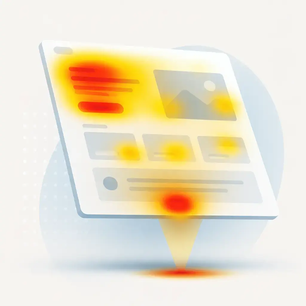
Visual hierarchy and the F-pattern: structuring content people actually read
Eye-tracking studies by Nielsen Norman Group established the F-shaped reading pattern as one of the most reliable behaviours online. People scan horizontally across the top, then move down the left side, occasionally scanning across again when something catches their eye. Your layout has to account for that.
In practice, that means putting your most important content along the natural left-to-right, top-to-bottom scan path. Headlines, value propositions and primary CTAs belong on the left or centre axis. Supporting details, case studies and secondary navigation can sit lower or to the right without losing visibility.
Visual hierarchy principles that improve conversion
Size sets priority. Your main headline should be the largest text on the page. Each section below it should reduce in visual weight, walking the eye through a logical progression.
Contrast directs attention. High-contrast CTA buttons beat muted or design-matched ones. Orange, blue and green rank among the highest-performing CTA colours in controlled A/B tests.
White space signals quality. High-performing B2B and SaaS homepages use generous white space to cut cognitive load, lift the perception of the brand, and isolate the elements you actually want people to click.
Directional cues work. An image of a person looking towards a CTA, or an arrow pointing at a form field, can increase click-through by steering natural eye movement.
This is what separates a homepage that looks professionally designed from one that converts. Aesthetics serve the conversion, not the other way round. A beautiful page that nobody acts on is just an expensive brochure.
CTA placement strategy: the most underused homepage decision
Call-to-action placement is one of the most studied and most misunderstood parts of homepage design. Strong pages don't treat the CTA as an afterthought to bolt on at the end. They build it into the page with the same care as the headline or the value proposition.
According to Baymard Institute's form design research, small, deliberate changes to button copy and the microcopy around it can lift conversions by up to 35% in tested checkout flows, mainly by reducing hesitation about what happens after the click. People don't click when they're unsure what they're agreeing to. Good microcopy removes that doubt.
Where the best homepages put their CTAs
Across 145+ high-performing homepages, three placement patterns came up most often. The simplest way to think about it is one button in each of three zones.
| Zone | CTA role | Why it works |
|---|---|---|
| Above the fold | Primary CTA | The main action (book a call, start a trial, request a quote) must be visible without scrolling. Non-negotiable for high-converting pages. |
| Mid-page | Reinforcement CTA | After social proof, case studies or feature breakdowns, a repeated or reworded CTA gives engaged visitors a natural point to act. |
| Bottom of page | Intent CTA | Anyone who scrolls to the footer has shown intent. A final, clear CTA with a direct value statement catches them before they leave. |
The wording matters as much as the position. Vague copy like "Submit" or "Learn More" loses to specific, benefit-led phrasing. "Get my free strategy session" or "See how it works for my team" speak to motivation and outcome. These are the kinds of decisions that compound over time when you keep testing them rather than setting and forgetting.
The "sticky" trap, and when it helps
Making your call to action persistent (a button that follows the user as they scroll, or a fixed header bar) can keep the action in reach without forcing people back up the page. On long homepages, that's genuinely useful. But it cuts both ways. A sticky bar that's too tall, too loud or too aggressive eats screen space and starts to feel like being nagged, especially on a phone. Keep it small, keep it quiet, and make sure it never covers the content someone's trying to read. The goal is to keep the action available, not to hound people into clicking it.
Trust architecture: building credibility through layout
Trust doesn't turn up in a homepage by accident. High-converting pages engineer it through deliberate placement of social proof, credentials and transparency signals. According to CXL Institute's website credibility research, trust signals matter to whether visitors believe you enough to act.
In practice, this is about putting proof where doubt lives. A visitor reading your headline wonders if you're any good. So a row of recognisable client logos near the hero answers that quietly. A visitor weighing up a feature wonders if it actually delivers. So a short testimonial or a hard number next to that feature answers it. The trust signal works best sitting next to the moment of hesitation, not buried on a separate "About" page nobody visits.
The usual building blocks: client logos, named testimonials with a real photo, a concrete result or stat, third-party review scores, security or compliance badges, and clear contact details. None of these are clever. They're just consistently underused, or shoved somewhere people never look.
How to audit your own homepage in an afternoon
You don't need a full rebuild to start. Here's a practical order to work through, roughly mapping to everything above.
- Run the five-second test. Show your homepage to someone outside the business for five seconds, then ask what you do and who you serve. If they can't answer, the hero is the problem. Fix that first, because nothing below it matters until it's right.
- Check what's above the fold on a phone. Most of your traffic is mobile. Open the page on a real phone and confirm your headline, a line of subtext and one clear CTA are all visible before any scrolling. If the button is below the fold on mobile, move it up.
- Count your above-the-fold CTAs. If there's more than one primary action competing for the click, cut it back to one. Save the others for further down the page.
- Follow the F-pattern. Read down the left edge of your page. Does the most important content sit on that path, or is it stranded out to the right where people skim past it?
- Pressure-test your button copy. Replace anything generic ("Submit", "Learn More") with copy that states the outcome. Then keep testing variations rather than assuming the first one is best.
- Place trust signals next to doubt. Make sure proof sits beside the claims it supports, not on a separate page.
Work through that and most homepages improve without touching the underlying build. The bigger wins usually come from changing what's on the page and where, not from a redesign.
Where IceBoxDesigns sees this go wrong
The most common pattern we see isn't a bad-looking website. It's a good-looking website that was designed to impress rather than to convert. Lovely photography, smooth animations, a hero that wins design awards and loses customers. The owner is proud of it, and rightly so on the aesthetics, but the enquiries aren't coming.
Nine times out of ten the fix is structural, not visual. Tighten the headline so it says what you do. Pull the main CTA above the fold and make it specific. Put proof where people are deciding. Cut the clutter around the action you actually want. None of that requires throwing the site away.
If you'd rather hand this over, our web development team builds pages around how people actually scan and decide, not just how they look in a portfolio. And if the structure is broadly right but you want to squeeze more out of it, our guide to increasing conversions with quick wins is a good place to start.
The short version
Your homepage layout is doing more work than your ad budget. Get the above-the-fold zone right, give people one clear thing to do, structure the page around how they actually read it, and back your claims with proof placed where the doubt is. Then test, because the difference between a 2% and a 4% conversion rate is the difference between the same traffic earning half as much and twice as much.
If your homepage looks the part but the enquiries aren't matching the effort you've put into it, that's almost always a structure problem, and structure is fixable. Talk to us about a build that's designed to convert from the first viewport down.
Frequently asked questions
How quickly do visitors decide whether to stay on my homepage?
Fast. A Nielsen Norman Group study found people leave a page within 10 to 20 seconds if the value isn't immediately clear. That's why the section above the fold, the part visible without scrolling, does most of the heavy lifting. If a visitor can't tell what you do and who you serve within five seconds, your hero section needs restructuring.
Should I have one call to action on my homepage or several?
Above the fold, one. Hero sections with a single clear CTA consistently outperform those with multiple buttons competing for the click. You can add reinforcement CTAs further down the page (after social proof or case studies) and a final intent CTA near the footer, but the primary action at the top should be singular and specific.
Does a big hero image hurt my conversion rate?
It can. A 2024 VWO A/B testing study found that landing pages with clear text and CTAs above the fold increased conversions by up to 20% compared with image-heavy designs. You don't have to drop imagery entirely, but the headline and call to action have to win. If a striking image is crowding out your message, the data says favour clarity.
Do I need a full redesign to improve conversions?
Usually not. According to Unbounce's CRO research, meaningful lift is achievable without a developer-heavy rebuild. Most gains come from structural changes: tightening the headline, pulling the main CTA above the fold, rewording button copy, and placing trust signals next to the claims they support. Run the audit first, then decide if anything bigger is needed.
Related articles


Related services
Need a hand with this? Here's how IceBoxDesigns can help.