
If you want to increase conversions in 2026, stop looking for one big fix. There isn't one. The marketers and business owners getting more bookings, more sign ups and more sales right now are the ones doing lots of small things consistently: growing their email list on purpose, fixing the landing pages that quietly leak visitors, and making sure their website is fast enough to deserve the ad spend pointing at it.
Key takeaways
- Every email database loses approximately 20% of its contacts every year. Do nothing and a 1,000 person list shrinks to roughly 800 engaged contacts in a year, and about 640 the year after. Nearly 40% gone in two years.
- Pop-ups convert far better than their reputation suggests: roughly 5% for first-time visitors, around 9% for repeat visitors, and over 10% when a timed pop up triggers after 30 seconds on a pricing page.
- Over 70% of first-time email opens happen on mobile. Design and test your landing pages on a phone first, not a desktop.
- A 5% landing page conversion rate means 95 out of 100 people walked away. Treat that as a problem to fix, not a number to accept.
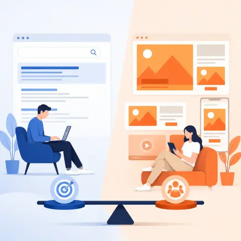
- Your ads and your website rise or fall together. The best campaign in the world can't rescue a slow site with a broken booking form.
Why conversions are harder to win in 2026
The online space in 2026 is noisier than at any previous point in marketing history. AI has made it dramatically easier for every marketer to flood every channel with offers, posts and content. More emails are going out. More social content is being published. The volume of everything has gone up.
The practical consequence: your dental practice for example isn't just competing with the practice down the road any more. It's competing with every other email, ad and post fighting for the same thirty seconds of your patient's attention. Getting conversions now means stacking many small, well-executed tactics rather than hunting for a silver bullet.
That's actually good news for a small business. You don't need a Hollywood budget. You need a checklist and the discipline to work through it.
Your email list is quietly shrinking, even if you do nothing wrong
Here's the stat that should worry any clinic, gym or practice relying on its patient or member list: every email database loses approximately 20% of its contacts every year. Addresses go stale, people change jobs, inboxes get abandoned.
Run the numbers. If you have 1,000 subscribers today and add no one new, you'll have roughly 800 engaged contacts by next year. The year after that, you're down to about 640. After just two years, nearly 40% of your original list is gone, and you didn't do a single thing wrong.
For a dental practice, that list is your recall system, your hygiene reminders, your whitening offers, your route to reactivating lapsed patients. For a gym, it's your January campaign. For a cafe or wellness clinic, it's how you announce a new menu, a new class or a new treatment without paying for the privilege every single time.
The fix starts with measurement. If database growth rate isn't one of your primary KPIs, tracked weekly or monthly, you will eventually have no one left to market to. Put list growth on the same dashboard as appointments and revenue. It earns its place.
4 ways to grow your database
1. Put your opt in front and centre on the homepage
The most common mistake is burying the email opt in: a small link in the navigation, or a form tucked away at the bottom of the page. Whether your opt-in is a newsletter, a free guide or an early access list, It should be theprimary hero element in the centre of your homepage. Front and centre, before anything else.
For e-commerce brands, framing it as access rather than discounts: "Get on our early drop list" or "Be the first to know." The psychology is FOMO reframed. People in 2026 don't just fear missing out, they want to be first. That instinct translates beautifully to local businesses. A matcha cafe can run "Be first to try the new seasonal menu." A clinic can offer a priority list for new treatment slots. A gym can promote early access to class bookings before they open to everyone.
If you're tempted to lead with a discount instead, do the maths first. Calculating the lifetime value of a discount driven customer against a full-price buyer before committing. If the lifetime values are comparable, a discount incentive is a strong play. If they diverge, an access-based offer that makes the subscriber feel like an insider is the better move. For a dental practice this matters enormously: a patient who joined for a cut-price check-up behaves very differently over five years than one who joined a priority booking list.
2. Use timed pop ups, and let the button copy do the heavy lifting
The standard objection to pop-ups is that they're annoying. When a pop-up appears on a major brand's site, you don't abandon your purchase in protest. You hit the X and forget it existed within seconds.
The numbers back him up. For first-time visitors, a pop-up with any kind of incentive, a guide, a discount code, early access, converts at roughly 5%. For repeat visitors, that climbs to around 9%. Timed pop-ups go further by triggering off behaviour rather than firing the moment someone lands. A pop-up offering an extra incentive to a visitor who has spent 30 seconds on your pricing page can convert at over 10%. Think about that for a clinic: someone who's been reading your treatment prices for half a minute is seriously considering booking. That's exactly the moment to offer a free consultation or a downloadable guide.
The single biggest lever, though, is the button copy. Don't use a flat yes/no. Make the yes option restate the benefit and make the no option uncomfortable to click. For example: "Yes, I'm ready for socks that keep my feet warm but not sweaty!" against "No, I like it when my feet are clammy, and I can't sleep." Nobody wants to click the button that describes them negatively, so they don't, and conversions jump. A dental version we'd write: "Yes, send me the guide to a whiter smile" against "No thanks, I'll keep putting off my check-up." Slightly cheeky works. Cruel doesn't. Keep it light.
3. Run lead ads on Instagram and Reddit
Organic list growth has got harder as both Google search traffic and organic social reach have declined. Paid acquisition fills the gap. Right now two platforms consistently deliver new subscribers for under $5, often in the $2 to $3 range. (Your costs in pounds will depend on your audience, but the gap between platforms is the lesson.)
The first is Instagram, specifically Reels and Stories lead ads with no more than 3 form fields. Every additional field significantly increases the cost per acquisition. The critical principle is keeping users on-platform: they complete the lead form without ever leaving the app, and the lead flows straight into your CRM or email platform via an API or a Zapier integration. For a gym or wellness clinic trying to drive people to a specific location, Instagram lead ads with tight local targeting are about as direct a route to a warm list as exists right now. For comparison, running the same programme on LinkedIn typically costs 4 to 5 times more to reach the same audience.
The second is Reddit. Reddit users are often mid funnel, actively researching a topic or trying to solve a problem, which makes them unusually receptive to relevant offers. Reddit lead gen ads let you target specific subreddit communities with a pop-up form, and the data flows into your CRM the same way as Instagram. Reddit has also recently launched a reminder ad unit: users click to receive a reminder about an upcoming sale, and Reddit sends both an email and a push notification at the designated time. For a launch event, a new class timetable or an opening week, that's a genuinely useful mechanism.
4. Buy endorsement ads in other people's newsletters
I would also advocates newsletter swaps with other publishers and paid placements in creator newsletters, with one big caveat: only endorsement-style ads perform meaningfully. When the newsletter creator writes the ad in their own voice, "I use this tool every day and here's why...", the reader's existing trust in that creator transfers to your offer. A banner dropped into someone else's newsletter doesn't carry that trust, so it doesn't carry the results either.
Locally, the same principle applies to partnerships. A wellness clinic featured in a local fitness influencer's newsletter, written in their voice as a genuine recommendation, will outperform a generic ad placement every time.
How the tactics compare
| Tactic | What the data shows | Good fit for |
|---|---|---|
| Homepage hero opt-in | Most visible real estate on your site; access framing beats buried links | Every business with a website |
| Standard pop-up with incentive | Roughly 5% conversion for first-time visitors, around 9% for repeat visitors | Clinics, gyms, cafes building a list |
| Timed pop-up (30 seconds on pricing page) | Converts at over 10% | Practices with treatment or pricing pages |
| Instagram Reels/Stories lead ads (max 3 fields) | Under $5 per subscriber, often $2 to $3 | Local businesses driving footfall |
| LinkedIn lead ads | Typically 4 to 5 times the cost of Instagram for the same audience | Usually not worth it for list growth |
| Reddit lead gen and reminder ads | Mid-funnel users actively researching; reminder unit sends email plus push notification | Launches, events, niche audiences |
| Newsletter endorsement ads | Only perform when written in the creator's own voice | Partnerships with trusted local voices |
Fix what's broken on your landing pages
Here's the reframe that should change how you look at your analytics. If 100 people clicked your email offer and bounced when they hit the landing page, that bounce isn't random noise. It's a coordinated response telling you something on the page is wrong.
Two fixes stand out.
Test on mobile first. Over 70% of first-time email opens happen on mobile devices. Designing a landing page on a desktop, checking it looks nice, and calling it done is a fundamental error. Every element, field length, button size, how images display, whether the text is readable, should be evaluated on a phone before the page is tested on anything else. For a dental practice this is even more acute: a patient with a toothache is searching on their phone, probably one-handed, possibly in pain. If your booking button is fiddly on a 6-inch screen, they're ringing the practice that answers faster.
Keep the offer above the fold and strip out the navigation. Every element that gives someone a reason to keep moving without converting is a risk. That includes content below the fold and it includes navigation menus. On a dedicated ad landing page, the menu is an exit door. Remove it. One page, one offer, one action.
If you want the fuller picture on measuring and improving this systematically, we've written a plain-English guide to conversion rate optimisation and why your website needs it.
Site speed: the conversion killer nobody budgets for
Here's the angle the original piece doesn't cover, and it's the one we bang on about most with clients. None of the above matters if your site is slow.
Think about what you're actually paying for when you run ads. Every click costs money. If that click lands on a page that takes ages to load on a 4G connection, a meaningful chunk of the people you paid for leave before they ever see your offer. You've bought the click and got nothing for it. Worse, Google Ads factors landing page experience into how it prices and positions your ads, so a poor page doesn't just lose the visitors it gets, it makes every future click more expensive too.
Speed problems on small business sites usually come from the same handful of causes: oversized images uploaded straight from a phone or camera, a pile-up of plugins nobody has reviewed in years, cheap shared hosting that buckles under any real traffic, and updates that never get applied. None of these announce themselves. The site "works" when you check it on the office wifi, and meanwhile mobile visitors on the train are giving up at second four.
The same goes for user experience generally. If the page jumps around while loading, if the booking form throws an error, if the phone number isn't tappable, your content quality is irrelevant. People don't convert on pages that frustrate them, however persuasive the copy is.
Your ads and your website have to work together
This is the relationship most businesses get wrong. They treat the ad campaign and the website as separate projects with separate budgets and separate owners. They're not. They're two halves of one machine.
You can have the best-optimised campaign in your industry, perfect targeting, sharp copy, sensible bids, and it'll still underperform if it points at a site with a broken contact form, an expired SSL certificate, or a checkout that fails on Safari. Equally, a fast, beautifully maintained website earns nothing if the ads pointing at it are bleeding budget on irrelevant clicks. You need both: ads that are properly optimised, and a website that's properly maintained. One without the other is money down the drain, which is exactly why we treat ongoing website maintenance as part of the conversion conversation, not a separate IT chore. Forms get tested, updates get applied, speed gets monitored, and the landing pages your ads depend on actually work the day someone clicks.
A quick story from our own client work. We've recently been running campaigns for a health and wellness clinic and a couple of gyms, driving people to a specific physical location, plus awareness work for a matcha cafe. In every case, the ad performance only came good once the website side was sorted: faster pages, clearer booking paths, forms that fed leads somewhere useful. The ads were never the whole answer. They were half of it.
Stop wasting spend before it reaches your site
Two ad-side disciplines deserve their own mention, because they're cheap to do and expensive to ignore.
Negative keywords
Negative keywords tell Google which searches you don't want to appear for. Skip them and you'll pay for clicks from people who were never going to become customers. A private dental practice, for example, typically wants to exclude searches containing "jobs", "courses", "dental nurse training" and, if it doesn't take NHS patients, NHS-related terms. A gym probably wants to exclude "equipment for sale". Every irrelevant click you block is budget redirected to someone who might actually book.
Review your search terms report regularly, weekly when a campaign is new, and keep adding negatives as the junk surfaces. We've covered this in depth for practices in our guide to Google Ads for dentists, and the same logic applies to clinics, gyms and any local service business.
Rotate and test your ad copy
Ads wear out. The headline that pulled clicks in month one gets ignored by month three because your audience has seen it a dozen times. Run more than one variant, change one thing at a time so you know what actually moved the needle, and retire losers without sentiment.
One rule above all: the ad's promise and the landing page must match. If the ad says "free consultation" and the landing page leads with your price list, you've broken the thread and the visitor leaves. Whatever the ad promises should be the first thing the page delivers.
Quick wins to increase conversions this week
You don't need a redesign to start. Here are fixes you can ship in days, not months:
- Add a banner at the top of your site with one clear call to action. "Book your appointment", "Reserve your class", "Order ahead", with a tappable phone number for mobile users. It's the first thing every visitor sees, so use it.
- Make your menu sticky, or add a sticky "Book now" bar on mobile. A visitor three screens deep into your treatments page shouldn't have to scroll back to the top to act. (One caveat: this is for your main site. Dedicated ad landing pages should still have navigation stripped out entirely, as covered above.)
- Move your email opt-in into the homepage hero and reframe it as access: early booking, first to know, new menu previews.
- Add a timed pop-up to your pricing or treatments page, triggering after 30 seconds, with benefit-led yes copy and a no option nobody wants to click.
- Pick up your phone and walk through your own booking journey. From Google search to confirmation. Every snag you hit, your customers hit too.
- Compress your images and check your load time on mobile data, not office wifi. This alone moves the needle on most small business sites.
- Test every form on your site this week, and put a recurring reminder in to do it monthly. A silently broken form is the most expensive bug a local business can have.
- Add five negative keywords to every active ad campaign. Open the search terms report; the candidates will be staring at you.
Don't waste the moment after someone converts
One last thought of our own. The thank-you page and confirmation email are the highest-attention moments you'll ever get with that person, and most businesses waste them on "Thanks, we'll be in touch." Use them. A dental practice can confirm the appointment and immediately offer to add it to the patient's calendar. A cafe or gym can show directions, opening hours and what to bring. A clinic can set expectations for the first visit. Someone who just converted is more receptive right now than they will be at any point in your follow-up sequence. Give them a useful next step while you have them.
Where to start
If this list feels long, that's the point. Conversions in 2026 are won by stacking small advantages: a growing list, landing pages that work on a phone, a site fast enough to deserve the clicks, and ad campaigns disciplined enough not to waste them. Pick three quick wins from the list above and ship them this week.
And if you'd rather have someone run the whole machine, the campaigns and the conversion side together, that's what our paid advertising service does for clinics, practices and local businesses every day. Get in touch and we'll tell you honestly where your budget is leaking and what to fix first.
Frequently asked questions
Why is my email list shrinking even though I'm not losing customers?
Every email database loses approximately 20% of its contacts each year through stale addresses, job changes and abandoned inboxes. A 1,000-person list with no new sign-ups drops to roughly 800 engaged contacts in a year and about 640 the year after, which is why list growth needs to be a tracked KPI.
Do pop-ups actually work, or do they just annoy visitors?
They work. A pop-up with an incentive converts at roughly 5% for first-time visitors and around 9% for repeat visitors. A timed pop-up shown after someone spends 30 seconds on a pricing page can convert at over 10%. The biggest lever is the button copy: make the yes option restate the benefit and the no option uncomfortable to click.
Is a 5% landing page conversion rate good?
Treat it as a starting point, not a target. A 5% conversion rate means 95 out of 100 people who clicked your ad or email left without acting, and that's usually a sign something on the page is wrong. Test on mobile first (over 70% of first-time email opens happen on phones), keep the offer above the fold and strip out navigation on dedicated landing pages.
Why are my ads getting clicks but no bookings?
Usually the problem is the website, not the ads. Slow load times, broken or fiddly forms, and landing pages that don't match the ad's promise all kill conversions after the click. Check your site speed on mobile data, test every form, add negative keywords to block irrelevant searches, and make sure the landing page delivers exactly what the ad promised.
Related articles


Related services
Need a hand with this? Here's how IceBoxDesigns can help.