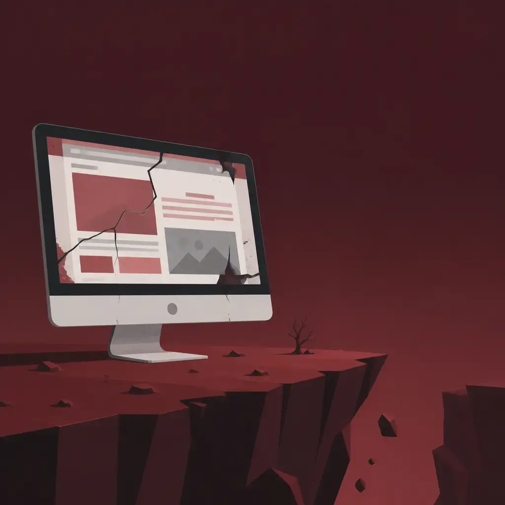
Your website is the first thing most people meet before they ever speak to you, and they make their mind up about you fast. Research shows people form an opinion about your business within 50 milliseconds (that's 0.05 seconds), and a big chunk of that judgement is based purely on how your site looks and feels. So if your website looks cheap, dated or confusing, that's the impression of your whole business, your service and your professionalism that lands. A bad website design doesn't just sit there looking ugly. It quietly costs you customers you never even knew you had.
This matters even more if you sell something people have to trust you with, like security, finance, health or anything bespoke. A slick product behind a clunky website creates a gap, and visitors fill that gap with doubt. Below we'll walk through exactly what your site is saying about you, what poor design actually costs, and how to turn it into something that earns trust and brings in leads.
Key takeaways
- People judge your business credibility on your website design, and they do it almost instantly. 75% of consumers say they judge a company's credibility by its website.
- A bad website drives people away: 88% of users won't return after a bad experience, and 38% leave if the layout or content isn't appealing.
- A new, well-built site makes you look fresh, current and worth trusting, which directly supports sales and lead generation.
- Content, function and design have to work together. A pretty site with weak content fails, and great content on a clunky site never gets read.
- The strongest sites guide visitors on a clear journey to the action you want them to take, sometimes with custom tools built for exactly that.
You've got seconds, not minutes
Here's the uncomfortable truth about attention online. The average visitor spends just 55 seconds looking at a page, and if we're being generous, around 5 minutes on a site overall. In that tiny window you have to communicate everything important about your business. If you can't, your site simply isn't doing its job.
That's the whole game. You're not writing a novel that people will sit and read cover to cover. You're trying to land the most important things about who you are and what you do before someone's attention drifts and they click away. Most sites lose because they bury the point, make people work too hard to find it, or look so untrustworthy that nobody bothers to dig.
And people do bail at the first sign of friction. As many as 88% of users won't return to a website after a bad user experience. Every time someone hits a broken link, a confusing form or a wall of navigation and gives up in frustration, you've almost certainly lost them for good. If a competitor offers the same thing in a cleaner, simpler site, your loss is their gain.
What a bad website actually says about your business
The problem isn't really aesthetic. It's what people infer. When your website looks haphazardly put together, visitors assume the rest of your business is too. They're not being fair, but they are being human.
Research backs this up hard. 75% of consumers say they judge a business's credibility based on its website design. When someone lands on your page, they're looking for affirmation that you're credible and an expert in your field. If the face of your business doesn't reflect that, you lose sales and you damage your reputation, even if your actual product is rock-solid.
It cascades. A poor user experience, thin content and unattractive visuals make people assume you put little effort into everything else, online and off. Spelling errors and sloppy design elements have the same effect. 38% of users will leave a website if the layout or content isn't appealing, and they'll discount you before taking any action at all, which is the entire point of having a site in the first place.
So the message a bad website sends is brutal and silent: "this business might not be worth the risk." You never hear it said out loud. You just see it in the leads that don't arrive.
A new website makes you look fresh, current and worth choosing
Flip it around. A sleek, professionally designed site does the opposite work for you. First impressions count, and you don't get a second chance at one. A clean, current design attracts new customers and builds loyalty with the ones you already have. Your product or service matters, but your website design is just as important to whether people choose you.
Think about how buying decisions actually happen. Say you sell eco-friendly phone cases. A customer searching online sees your site alongside a list of competitors, and they open a few tabs to compare. A memorable, professional design with an approachable interface makes them more likely to come back to you. That's it. The better-looking, easier-to-use option wins the second look, and the second look often wins the sale.
A modern site also signals that your business is active and growing rather than stuck in the past. Design moves on, expectations move on, and a website that's clearly been left untouched for years quietly tells people you might have been too. Keeping your site current isn't vanity. It's how you stop looking like the safe-but-stale option next to a competitor who looks like they're going somewhere.
There's a confidence factor here too. Online users trust brands based on what they see, especially when they're about to spend money. A professional-looking site reassures them. A scrappy one makes them hesitate, and hesitation in a buying journey usually means they leave. If you're weighing up whether a fresh build is worth it, our take on website design trends for 2026 shows what "current" actually looks like right now.
What makes a website bad (so you can spot it on your own site)
It helps to be specific about what "bad" means, because most poor sites aren't dramatically broken. They just chip away at trust in small ways. The usual culprits:
- Slow loading speed, which sends your bounce rate up as people give up waiting.
- Poor SEO, so the right people never find you in the first place.
- A non-responsive design that isn't mobile-friendly, which is a problem when so many people browse and buy on a phone.
- Confusing navigation and hard-to-understand layouts, creating a frustrating experience.
- Unattractive layout, images, colours and fonts that undermine credibility.
- Weak content with little or no clear call to action, so even engaged visitors don't know what to do next.
- A disorganised or incomplete design and marketing strategy behind the whole thing.
Navigation deserves a special mention because it does so much damage so quietly. Up to 53% of business websites lose visitors because people find the navigation menu hard to use. When someone arrives with a goal and can't work out how to reach it, they don't email you for help. They go to your competitor and finish the job there in a few clicks.
Mobile is the other one people still get wrong. People spend hours on their phones reading, shopping and getting in touch, so your site has to be genuinely easy to use on a small screen, not just technically loadable. You don't need two separate websites, but the mobile experience has its own quirks and needs proper attention.
Content, function and aesthetics: you need all three
This is the part businesses most often misjudge. They think a website is one thing, when it's really three things working together.
Paying for a fancy design and then walking away is not the answer. Your website is prime real estate for your business, and snazzy bells and whistles are no substitute for high-performing functionality, content that's on-the-nose and a design people actually want to look at. You need all three combined to produce a site that clearly and concisely shows your value.
Great content matters because design alone runs out of road. A regular flow of interesting, relevant material keeps people engaged and coming back, and it helps your SEO and traffic too. A blog is a good way to share useful information and show your brand's personality. But content can only take you so far. As the saying goes, the secrets of the universe could be written on a blank HTML page and nobody would bother to check. If the site is ugly or hard to use, your brilliant content never gets read.
The reverse is just as true. A beautiful site with thin or muddled content looks great for about five seconds and then leaves people none the wiser about what you do. The design draws them in. The content and the functionality are what keep them and convert them. If you're thinking about how content and structure fit together, our piece on conversion rate optimisation covers how to turn visitors into enquiries rather than just pretty traffic.
Start with your content and your value proposition
Before you touch a single colour or layout, get the message right. Rewriting your website content well needs two things, and they're harder than they sound.
First, knowing what you actually do: the products and services you offer, stated plainly. Sounds obvious, but you'd be surprised how many businesses struggle to articulate it. Second, truly understanding what your customers and prospects want from you, at the exact moment they land on your site. Nothing shows off your strengths better than knowing what your audience is after right when they arrive.
That core message is your value proposition, and it should run through everything: your website content, your campaign marketing, even an off-the-cuff social post. A strong, clear value proposition is at the heart of successful marketing. Plenty of businesses can't even get started on defining it, which is where a focused exercise to trim the fat and find your core identity earns its keep. Get this right and the website almost writes itself, because you finally know exactly what you're trying to say and to whom.
The practical order, then, is: nail the message, then build the site around it. Doing it the other way round, designing first and shoehorning words in later, is how you end up with a good-looking site that doesn't say anything.
Design for the journey, not just the homepage
A great site doesn't just look good. It moves people. Every page should have a clear job, be clearly titled and easy to reach, and nudge the visitor towards the action you want, whether that's an enquiry, a purchase or a sign-up. A call to action persuades people to take the next step. Without one, even an impressed visitor leaves not knowing what to do, and a visitor who leaves is no use to you.
This is where understanding your audience really pays off. Different demographics want different things from a site. A business aimed at tech-savvy women in their twenties needs a very different design and tone to one targeting men over 60. Knowing who you're talking to shapes the layout, the content, the imagery and the path you build through the site. Design with the audience in mind and the whole thing feels effortless to use. Ignore them and it feels like it was built for you, not for them.
The goal is a journey that's systematic, logical and easy to interact with, where users always know where they are and what to do next. That's what turns a website from an online brochure into something that actually generates leads.
A real example: building tools that do the selling for you
Here's where this gets concrete. One real project involved a UK-based security services provider. They already had a perfectly functional website, built fairly recently elsewhere. On paper, fine. In practice, it was holding them back.
Two problems. First, the business had moved on, and the site no longer communicated what they could actually offer customers today. Second, behind the scenes the functionality wasn't there to let them grow and add new offerings. It had been built for the now, not for the future. That's a trap a lot of businesses fall into: a site that's adequate the day it launches and a liability eighteen months later.
What they wanted was a site that could grow with them, and that took customers on a genuinely useful journey to understanding their cybersecurity offering. Specifically, they wanted visitors to end up understanding which security operations centre (SOC) suited their business, to come away with usable evidence that the SOC was a real business need, and to trust that this provider was the right people to deliver it.
The answer wasn't more pages. It was two bespoke, user-friendly tools built into the site. The first lets a customer input their specific security needs and get back a list of all the suitable SOCs for them. Useful, but only half the battle. The provider knew their customers' biggest headache was justifying the cost of a SOC to their colleagues. So the second tool was a data-driven calculator that takes a user's data and works out the potential financial damage a cyberattack could cause their business.
Those two tools became the solid core of the new site. They guide customers straight to what matters most to them, fast, and they give people a reason to stick around and learn more. That's the difference between a site that describes your service and a site that helps people buy it. This is exactly the kind of thing a bespoke build delivers that an off-the-shelf template can't, and it's why some businesses move to custom software and tools built around their actual process rather than forcing everything into a generic page.
Standing out when your whole sector looks the same
The security provider also wanted to look different, and there was a real obstacle: security solutions come with a very predictable visual language. Keys, padlocks, anonymous hackers in masks, you know the drill. Following that convention is the easy, boring choice, and it makes you blend into every competitor.
Instead, the approach used consistent image theming based on defensive structures from the real world, both natural and manufactured. The existing brand identity was expanded too, keeping the established colour scheme but adding a secondary palette to give the brand new dimensions. The result stands out instead of disappearing into a sea of padlock clip-art.
The lesson applies way beyond security. Most industries have their own visual cliches, the stock images and colours everyone reaches for by default. Leaning into them makes you forgettable. A bit of thought about how to look distinctive, while staying true to who you are, is often the cheapest way to stand out in a crowded market. Your website is where that distinctiveness lives.
Know where you stand today
The sensible starting point is an honest look at your current site. Does it still say what your business actually does now, or what it did two years ago? Is it built to grow, or built for the moment it launched? Does it load fast, work properly on a phone, guide people somewhere useful, and look like a business worth trusting? Or does it quietly leak credibility on every visit?
Most owners are too close to their own site to see this clearly, which is why a second pair of eyes helps. The point isn't to chase trends for the sake of it. It's to make sure your website is pulling its weight as the most public, hardest-working asset your business has. If you fix nothing else this year, fixing the impression your site makes in those first 50 milliseconds is probably the highest-return change you can make.
A good website doesn't have to be flashy. It has to be clear, current, easy to use and built around what your customers actually need. Get that right and your site stops quietly costing you customers and starts winning them.
If your website no longer reflects how good your business actually is, that's worth fixing. We build sites and bespoke tools designed around your customers' journey, not just nice-looking templates. Take a look at our web development and custom software work and let's talk about what your site should be saying about you.
Frequently asked questions
How quickly do people judge my website?
Very quickly. People form an opinion about your business within 50 milliseconds (0.05 seconds), and that judgement is heavily influenced by how your site looks and feels. The average visitor spends just 55 seconds on a page, so you have to communicate the important things fast.
Does website design really affect whether people trust my business?
Yes. 75% of consumers say they judge a business's credibility based on its website design. If your site looks haphazard, visitors assume the rest of your business is too, even when your product is excellent. A professional, current design reassures people, especially when they're about to spend money.
What actually makes a website bad?
Common culprits are slow loading speed, poor SEO, a design that isn't mobile-friendly, confusing navigation, unattractive layout and visuals, and weak content with no clear call to action. Navigation alone is a big one: up to 53% of business websites lose visitors because the menu is hard to use.
Should I focus on design or content first?
Start with content and your value proposition. You need to state plainly what you do and understand what customers want at the moment they arrive. Once that core message is clear, you build the design and functionality around it. Design, content and function all have to work together; a pretty site with weak content fails, and great content on a clunky site never gets read.
Related articles


Related services
Need a hand with this? Here's how IceBoxDesigns can help.